By Brad Ross, Global Trend Forecasting
This month’s focus is on color. Today, color is like Snapchat; we get flashes of hue predictions and as soon as one appears it’s gone just as quickly, with something even newer on the horizon. Last year I spoke to the color family of blues. That forecast has not only proven to be accurate, but is still momentous.
My strong support of blues continues this year, while introducing a fresh color trend for the very near future. This is not a specific fashion color, but a mood of colors. These mood colors are life colors, based in nature. If this theme sounds familiar, you’re right. I have been speaking to the natural and its’ influence on a multitude of methods, disciplines and processes. Like the 70’s influence, it is paired down to nature’s palate and finds its’ highs and lows dictated by the time of day or amount of reflective light demonstrated.
CLICK HERE to view Trend Perspectives with Brad Ross: 2016 Color Trends
As we move into 2017/18 we will continue to witness some monumental shifts as sustainability becomes more overt, and old social signifiers are eroded. Color will be a strong signal as it reaches deep into the natural and illuminates natures hues. On the surface, it seems common and not entirely unique to normal color cycles, however the context of these colors will be presented in products and imagery we might not expect; which will be fresh to consumers across the globe.
We will be inspired by the golden hours of dusk and dawn and alternate from grounded earthy to high-definition intensity.
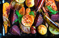
Firey colors of sunset will be key; tempered with the darker reds and blue tones that have an intense saturation and offer dramatic contrast. Much like nature, these colors offer a unique balance, with dark shades both anchoring and accentuating the brights.
For more trends, CLICK HERE to subscribe to the weekly in-sight newsletter!
These colors go beyond face value, suggesting an inherent urge to connect with nature in a direct, physical way that is reminiscent to the social norm of the 70’s. Wood tones and desert colors bring warmth to the consumer experience, enhancing an earthy calm and nostalgia. These hues are also widely evident in photography and merchandising.
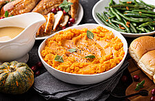
And food itself is the cornerstone of these colors, with multi-colored carrots, heirloom tomatoes and eggplant blossoms, where nature’s own details give inspiration for a range of new naturally enriched colors. http://www.shape.com/healthy-eating/diet-tips/dirt-heirloom-vegetables
Consumers are driving the demand to, not only buy organic fruits and vegetables, but ones that beautifully reflect their origins. This yearning for a simpler, healthier way of living continues to dictate food packaging and marketing. With softer, more natural colors on boxes, bottles and cans, food producers will be faced with a fairly steep yet reasonable challenge: making good, wholesome food. Though always a big hit with kids, when it comes to adult consumers, gone are the days of hot pink cupcakes and neon green yogurt (and packaging that accentuates them). Today’s colors are wonderfully natural and nourishing to the eyes, body and soul.