 By Cynthia Maxwell, Trend Forecasting
Cherry Tomato, Lime Punch, Ultra Violet! These are some of the bright additions to Pantone’s spring 18 fashion color palette.
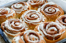
I talked about the importance of soft, muted, pastel color in October, based on Pantone’s Spring '18 palette and Spring '18 Fashion Week. On the flip side there was a resurgence of bold saturated color worn monochromatically or color blocked. There were shades of hot pink, intense pure green, bright yellow and yes.. tomato red.
CLICK HERE to read my last article: Looking at the Future of Color Trends
Marc Jacobs’s show was a beautiful representation of both these bold and soft color stories. His runway flowed from bright to soft shades, sometimes mixed in prints, color blocked and grounded with a few neutral shades along the way. Jacob’s colors were also just a bit off from traditional color palette hues, creating new spring color sophistication.
For fashion, it’s all in the way these colors are executed based on fabrics and silhouettes. Wearing one bold color head to toe takes the likes of Tom Ford, Marc Jacobs and Carolina Herrera to show us how it’s done. But with food and beverage packaging we already know bold colors are at the top of list:
- Red is the number one eye catching color and triggers appetite
- The brain releases serotonin at the sight of Yellow
- Green is associated with healthy, organic and natural foods
- Convenience snacks are attractive packaged in Orange
Yes, there is a whole psychology behind food packaging color! The customer likes to be romanced these days, so it is important to think beyond these long standing color favorites.
CLICK HERE to read my article: Unique and Innovative Product Packaging
This is just what online retailer Thrive Market has done with their food packaging. You will not see true primary and secondary colors here but rather a more interesting version-and sometimes the packaging colors have nothing to do with what’s inside. For instance a bright lavender color used on chia seed packaging, golden color for garbanzo beans, and a bold aqua shade used on their coconut flake cereal. I was amazed at the close match to their lentil in the monochromatic packaging of the legume. Thrive Market’s packaging design and color are true artistry and they have won awards for it.
There was Starbucks huge success with the electric teal and pink Unicorn Frappuccino earlier this year followed by the Zombie version for Halloween in neon pink and green. Naturally colored pink noodles and blue rice happened in this year’s top trending unicorn sushi. Let us not forget those bold colored smoothie bowls that showed up all over Instagram!
Get ready for a bright colored Spring!
For weekly inspiration, CLICK HERE to sign up for our newsletter