 As we head into fall and winter thinking only of pumpkin flavors, turkey, holiday décor and cold weather clothing, the Spring 2018 runways have ended and Pantone has released their color palette for spring as well. Yes, it may be wild to think about spring ‘18 this early, but this is how the design and retail industry work. By the time we get to February consumers will be ready to lighten up! So my focus this month is on the soft color ranges that will be important for spring. This color range is just one from the spring season that will influence several product categories.
CLICK HERE to read my last article: The Changing Face of the Retail Store
Pantone has expanded their spring color palette with the intention of giving designers more options as consumers want variety. Plus the seasonal and gender boarders are becoming less defined. Now color could flow easily from season to season without hard breaks or rules within the palettes. White for example is perfectly acceptable for fall and winter these days when executed in correct seasonal fabrics-and yes, even in shoes!
Pink Lavender (my fav!), Almost Mauve, and Blooming Dahlia are some of the soft colors from the Pantone palette, and they were also strong on the spring runways. This color palette aka “pastels” is not a new trend by any means. In fact, pink has even been a top color callout for men for the last few seasons. So this season was no exception, however designers approached these shades by layering the same soft hue in one look. Michael Kors, Tom Ford and Sies Marjan used matte and shine fabrics to create a gorgeous pastel sophistication. Pastels are now elevated and new all of a sudden.
For more trend articles, CLICK HERE to sign up for our weekly newsletter
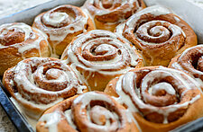
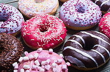
Pastel color can be nostalgic to consumers reminding them of their childhoods so it’s always relevant in confectionery. I am delighted to see a case full of pastel Laduree macaroons or the newer trending marshmallow flavors. Marshmallow brand Smashmallow’s packaging colors are light and sweet combining several different ranges of the same color per flavor-yummy “Strawberries and Cream” and “Meyer Lemon Poppy Seed!”. But even the fruit infused waters like Blossom Water are beautiful representations of soft color naturally-“Lemon Rose” has rose and lemon essence.
When executed correctly using subdued, muted color in packaging can have a luxurious feel in both savory and sweet categories especially when combined with silver, gold and copper. Softer color versions of pink, blue, violet and green have a calming effect and lavender is often used to evoke spiritualism.
Because this palette continues to grow stronger season after season in the fashion industry, the consumer will soon start to gravitate to it and even expect it’s newness in non-fashion related products. I know that’s where my eye goes when I am in a grocery store amidst all the sometimes overwhelmingly bold colored packaging. That’s why Smashmallow looks so unique-because it is, both inside and out. Remember it’s all about catching the consumers eye these days!
CLICK HERE to read Brad Ross' 2017-18 Color Forecast
For all you pastel haters out there don’t worry spring ‘18 will be full of bold bright color as well-and that’s what I’ll talk about next month!